Metromile
Brand Refresh
Role: Creative Director
Illustration: Polyester Studios
Motion: Camila Lachman
Over the course of 9 months, I led the brand refresh at Metromile. This included a logo refresh, new color palette, new typeface, new illustration style, new photography style, a new set of iconography to be used across marketing and product and the introduction of motion as an integral part of our storytelling. Once the brand elements were solidified, I worked closely with the product team to translate the brand vision into our UX component library. I helped build the creative team, hiring and mentoring a team of creatives. As a hands on CD, I directed in house and external talent, contributed to design initiatives, and led a small but nimble creative team.
Below are a few slides from the Brand Refresh.


Website Refresh


State Specific Landing Pages based off of the winning Home Page test were created to capture more targeted leads.

Additional Pages

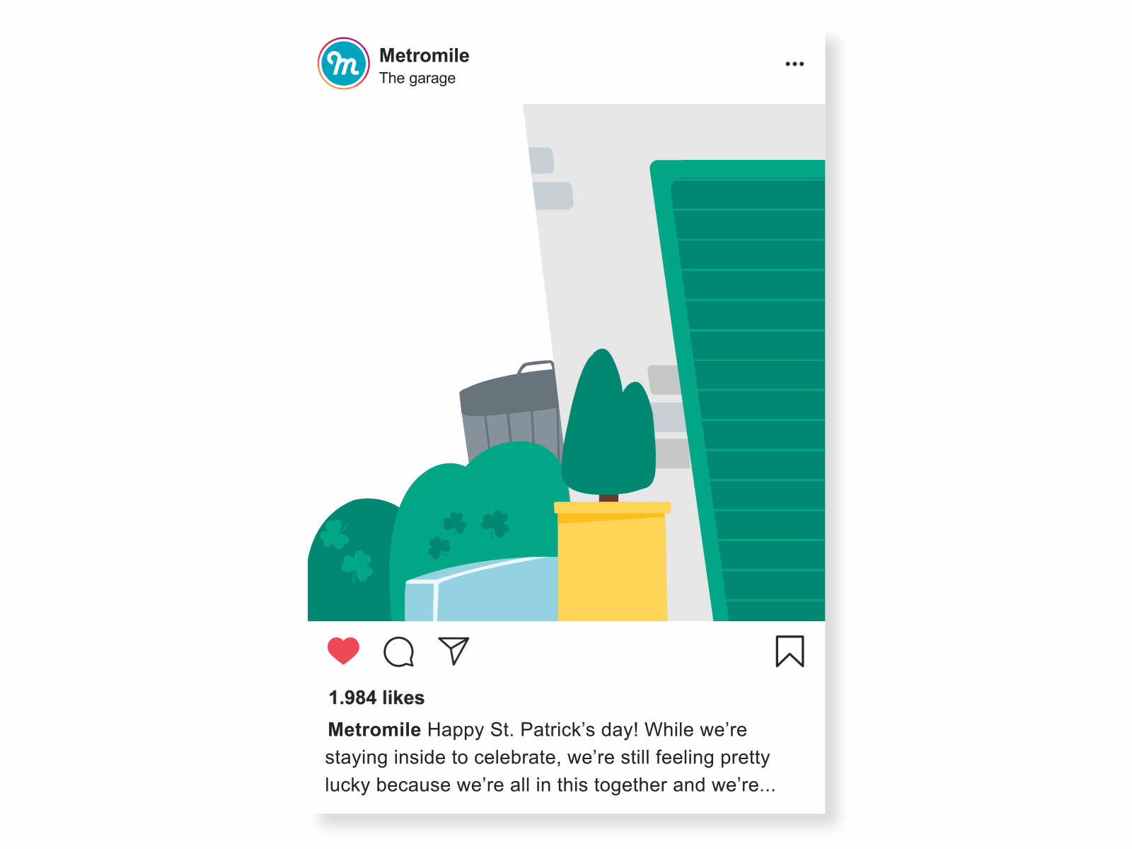
Motion played an integral part of the Brand Refresh. It allowed us to take storytelling to new heights by bringing flat objects to life and to help spark emotion. Below are a few examples of how we did that from email, to product screens, to social media and home page tests.


Before & After
Everybody likes a good makeover story. Below are a few examples of the brand evolution.


